 Potterdom Mod Potterdom Mod
Book Club Mod

DMAC & DoM
  Giant
Join Date: Jul 2003 Location: Ferrix: GMT-6
Posts: 56,907
Hogwarts RPG Name:
Moritz Schultz (#0f667e)
Ravenclaw Seventh Year
Hogwarts RPG Name:
Nancy Schultz (#ac6f77)
Hufflepuff Fourth Year
Ministry RPG Name:
Jabari Rahal (#c54031)
Mysteries
Ministry RPG Name:
Calloway Bennigan (#b8b323)
Accidents & Catastrophes  x11 x11  x1 x1
|  October 2014: Becky October 2014: Becky curly haired prefect - "sometimes I get angry!" - 30/90 - *chicken emoji* - probably @ Disney - I speak dog

Hello SSers! Once again thank you all SO MUCH for being patient with us as life got a bit crazy for the MM's mods. And thanks a BUNCH to our pick for October for being equally patient and super dooper awesome - BECKY! Becky has been around MM's for quite some time, and I'm super excited to announce that she made not only one, but TWO tutorials for you guys! Our interview is also below so you can learn a bit about Becky and how she became the awesome graphic maker she is today. Congrats Becky!
SPOILER!!: Part 1 :: Interview Interviewer (Lissy Longbottom) - Italics Interviewee (Becky) - BOLD Hello lovely SSers! Thanks so much for being patient with us in MM's as life got a little crazy for a few months. BUT we're back with our awesome graphic maker of the month for the month of October - BECKY! You've probably seen her entering our graphics contests recently, and those of us who have been here for years are already familiar with her awesome tutorials (speaking of, we've got a DOUBLE tutorial for you guys this time around!) past graphic shops and her willingness to get involved in all sorts of other fun stuff around the site! So without further ado, let's get started! First off, HI! How are you?! Second of all, how long have you been making graphics now? How did you first get into it? Im okay! Uhm, how long? Jeez, thats a question and a half. I think 6 years
? Dont quote me on that, though. I first got into it when Linda (Slytherin Fox) suggested I try it out. Thinking back, I wasnt very good at it back then. I do cringe when I look back at what I created. Awww yes, I remember you and Linda used to be a team! *tries to use mind power to bring her back to SS* I think most people tend to do that when they look at their past work! I know I certainly do haha...so what did you first use when you were starting off? What programs do you use now? I think shes moved on to modding other sites now  At first, I used GIMP because it was free, but now Im on CS6. I mostly use photoshop, but sometimes a graphic calls for Illustrator, especially a text heavy one. I keep hearing about Illustrator and have to seriously look into it, because it sounds AWESOME. And GIMP is a great way to get your feet wet in the world of graphics! I could never figure it out, but I know you and a few other people have used it and made some super pretty stuff! At first, I used GIMP because it was free, but now Im on CS6. I mostly use photoshop, but sometimes a graphic calls for Illustrator, especially a text heavy one. I keep hearing about Illustrator and have to seriously look into it, because it sounds AWESOME. And GIMP is a great way to get your feet wet in the world of graphics! I could never figure it out, but I know you and a few other people have used it and made some super pretty stuff!  So do you make graphics outside of SS at all? Like for school or other sites? It really is! The vectors are so easy to work with So do you make graphics outside of SS at all? Like for school or other sites? It really is! The vectors are so easy to work with  GIMP was always easier to me than Photoshop until I actually learnt how to use it properly, I guess it was more like baby steps for me. I definitely do! Today I created two booklets and two booking forms for a Wedding DJ. Im actually a qualified Graphic & Multimedia Designer, so
yeah GIMP was always easier to me than Photoshop until I actually learnt how to use it properly, I guess it was more like baby steps for me. I definitely do! Today I created two booklets and two booking forms for a Wedding DJ. Im actually a qualified Graphic & Multimedia Designer, so
yeah  That's so awesome! I love that time and time again, SS seems to get our graphic makers hooked on actually making a career out of graphic making! Who says spending time on the internet doesn't pay off? That's so awesome! I love that time and time again, SS seems to get our graphic makers hooked on actually making a career out of graphic making! Who says spending time on the internet doesn't pay off?  So what's your favorite tool/technique at the moment? If you could describe your "style" at the moment what would it be? Haha, I know! Its definitely what gave me the push. I used to want to be a paramedic. Graphics changed all of that for me, though. Oh gosh
Im really into Selective Colouring at the moment. Its amazing to be able to change the balance of a picture just by using the colouring. My style? Id say simple
or minimal. I dont really like creating crowded things right now. Very nice - and I LOVE the selective coloring tool as well! My real motivation behind actually buying the real version of PS hahaha...well, I think that just about does it! Thanks so much for taking time out of your day to talk about graphics with me, and I cannot WAIT to see the tutorial (or tutorials, I should say!) you have in store for us! I got all my Adobe stuff cheaper because of the student stuff, so that helped! Anytime! I love talking about graphics with anyone Thank you for talking to me, too, and for this awesome honour! So what's your favorite tool/technique at the moment? If you could describe your "style" at the moment what would it be? Haha, I know! Its definitely what gave me the push. I used to want to be a paramedic. Graphics changed all of that for me, though. Oh gosh
Im really into Selective Colouring at the moment. Its amazing to be able to change the balance of a picture just by using the colouring. My style? Id say simple
or minimal. I dont really like creating crowded things right now. Very nice - and I LOVE the selective coloring tool as well! My real motivation behind actually buying the real version of PS hahaha...well, I think that just about does it! Thanks so much for taking time out of your day to talk about graphics with me, and I cannot WAIT to see the tutorial (or tutorials, I should say!) you have in store for us! I got all my Adobe stuff cheaper because of the student stuff, so that helped! Anytime! I love talking about graphics with anyone Thank you for talking to me, too, and for this awesome honour!
SPOILER!!: Part 2 :: Tutorial #1 - Graphic
This is my original image in photoshop. 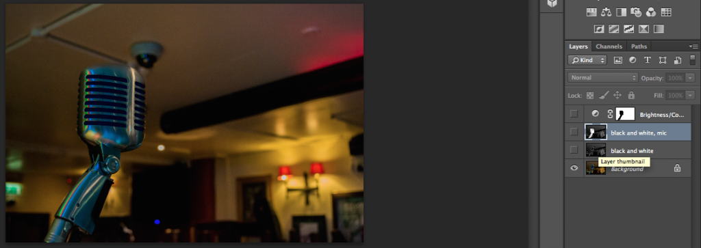
I created a greyscale version of the image and then doubled the layer. Once that was done, I cut out the shape of the microphone and deleted the original greyscale layer. That left me with this image. 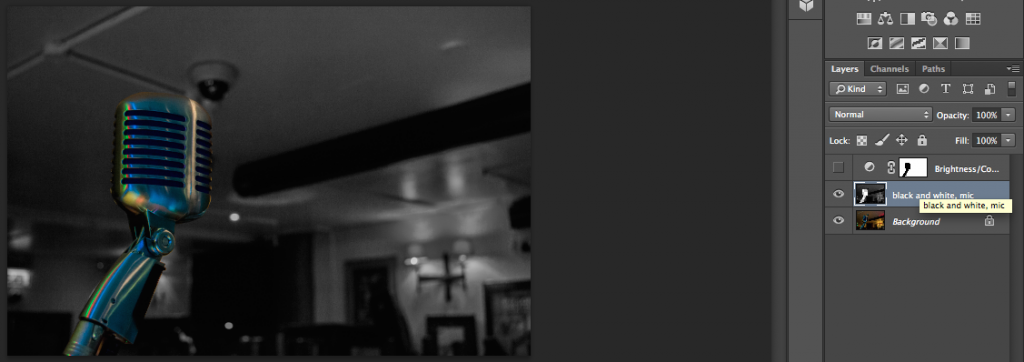
To bring out the microphone's colours, I darkened the background even more using a selective colouring layer 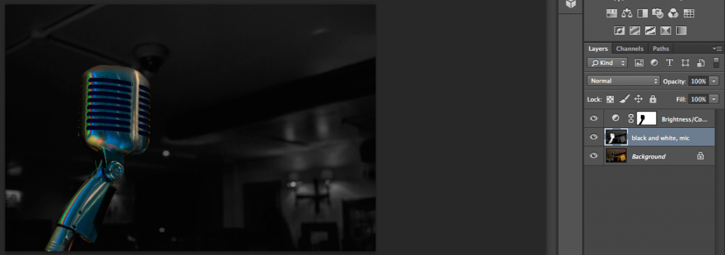
I removed the background using another layer that was just coloured with black and then added the simple text 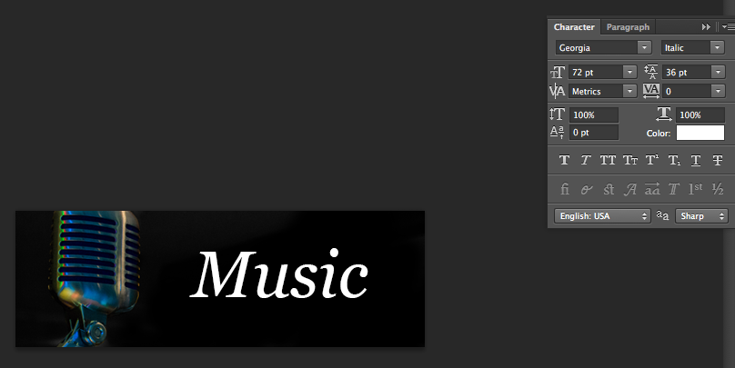
Once that was done, I kerned it and got to my final outcome: 
SPOILER!!: Part 3 :: Tutorial #2 - Type
Firstly, I'd like to help you to set up a document for screen usage. I named my file, and then gave the dimensions to it. My usual ones are 450x150 for siggies. This leaves space for text, too. The resolution should be 72 pixels per inch and the colour mode should be RGB. 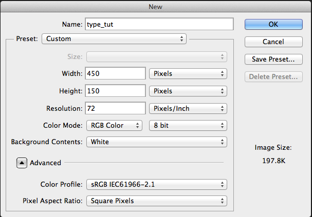
Key:
Red - Point size
Blue - Leading (Pronounced leading, as in pencil lead.)
Green - Kerning
Yellow - Tracking 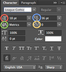
For this typeface, I usually set the leading and the point size to the same amounts. Usually, the leading is on 'auto' as shown below 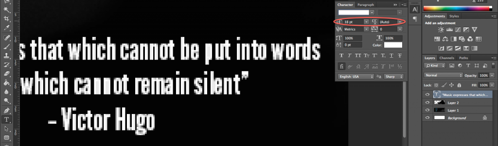
Leading is the amount of space from the baseline of one line to the baseline of the next line. 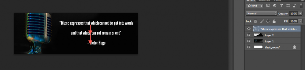
When the leading isn't correct, the descenders and ascenders can almost touch and become illegible. This is why leading is important. 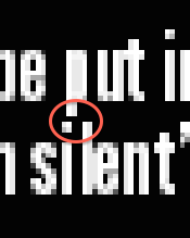
In the image below, the u and the s are almost touching. This is where kerning comes in. Kerning is the spacing between each letter, and sometimes typefaces are created in a way that it will look natural when typing a lot of text, but when it's larger and there is less text, it can look a little unbalanced. 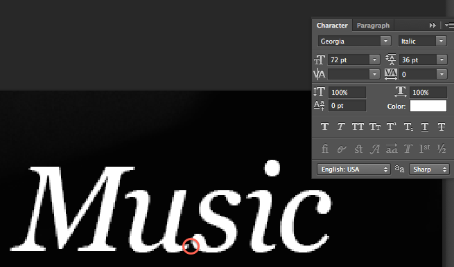
Using the kerning tool (circled below) can be confusing at first. There is a game to help you practice and learn this! Link here. My personal best on this is 97%, so try and beat that! If you do, I'd absolutely love to hear! If you absolutely can't fathom how to do this, don't worry about it. There's an 'optical' option for you. It may be slightly different to what you'd get if you did it manually, but that's definitely better than not doing it at all. 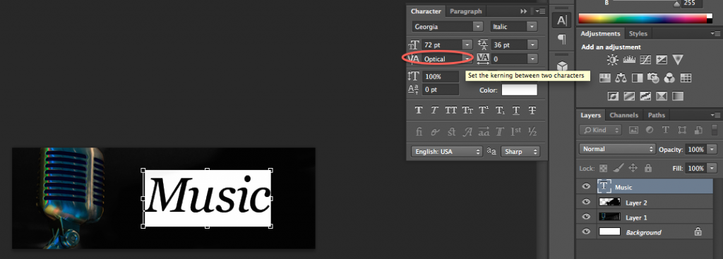
This next tool is the tracking tool. It spaces the letters out with the same amount of space between each one. This should always be used in conjunction with the kerning tool to give the best effect. To use it, highlight the text and either use the drop down menu, or left click and slide either left to bring the letters together, or to the right to space them out. 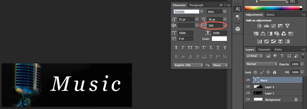
__________________ I'm still standin'________________________________________ better than I ever did

Lookin' like a true survivor_________________________________feelin' like a little kid |