| Kelpie
Join Date: Sep 2006 Location: BUE - Left Coast
Posts: 26,239
|  September 2013: iBeJenn September 2013: iBeJenn Big Tuna | Booger | Team Men | Chris's SS!BFAM | Jules says I'm RAD | #Superman | Dustbin
 Our first spotlight is on iBeJenn, better known to some of you as Jenn (never would have guessed that her name is Jenn, wouldja? hehe). She was kind enough to sit down with me for a quick interview, as well as provide us with a quick coloring tutorial and a look into her portfolio. Look under the spoilers to read all about Jenn!
Text Cut: Part 1: The Interview Interviewer - cake.ninjak (Kelvin)
Interviewee - iBeJenn (Jenn)
Kelvin: So first things first - how did you get into graphic making? Was Snitchseeker your first exposure to a graphics-making community?
Jenn: I think I started graphic making way before I even knew what Snitchseeker was. When I started making graphics, I really just wanted to make little icons for MSN and have a nice display picture. But after discovering Snitchseeker and the Madame Malkin's forum I thought "hey... this seems like fun" so from there I really tried to make nice graphics and try out new things.
K: Oh that's awesome! I used to just go to the icon sites that used to be really popular to get my buddy icons. Haha.
J: THAT was what made me want to make my own icons, because there were all these cute ones and it was just like "d'awwwh. so pretty. I want those skills".
K: Hahaha I'd be lying if I said I hadn't thought that a few times as well.
So when you're making graphics then, what kinds of things inspire you? Do you actively look at other sources for inspiration, or are you just struck randomly?
J: It's funny you ask me that because I had to write about this for a college admission essay. haha. There are a few things that inspire me to make graphics - music, tv and other people. I love seeing what everyone makes and then after admiring their graphics for a bit... I want to make something better. LOL. But mostly music. I like listening to iTunes and letting that determine what I make. Darker graphics are probably because I'm listening to sadder songs than when I make lighter graphics... Or it depends on the part of an episode of whatever show or movie I'm watching/listening to. And I also like looking through Deviantart because, as you can probably tell from my graphics, I use a LOT of textures and Deviantart is a great place to find textures and just... stare at all the prettiness there.
K: Yeah, textures are great! I have definitely noticed that you love to use those, and if I do say so myself, you use them very well!
Since textures relates a bit to style, how would you describe your style of graphics? And is there a specific type of style that you really enjoy but don't necessarily try to emulate?
J: Awwwh, thank you.  I don't know exactly how to describe my style of graphics, especially since I feel like it keeps changing! But if I HAD to describe my graphics I'd say "unnecessarily complicated" because of all the random layers and textures I have on top of each other. Which is why I love simple graphics. I like seeing something clean; like a person, some coloring and a little bit of text. It's something simple and effective and really showcases someone's ability to color graphics. Sadly, every time I try to do something like that, I try to make the text all fancy to make up for the lack of background. haha. I don't know exactly how to describe my style of graphics, especially since I feel like it keeps changing! But if I HAD to describe my graphics I'd say "unnecessarily complicated" because of all the random layers and textures I have on top of each other. Which is why I love simple graphics. I like seeing something clean; like a person, some coloring and a little bit of text. It's something simple and effective and really showcases someone's ability to color graphics. Sadly, every time I try to do something like that, I try to make the text all fancy to make up for the lack of background. haha.
K: Sadly? Your stuff always turns out great! I don't think that's sad at all. But I like that you describe your style as "unnecessarily complicated." Haha. Not that I agree, but I think it's funny. 
What are your favorite types of graphics to make?
J: You're just saying that because you're interviewing me.  haha. Anyways, my favorite type of graphics to make on Snitchseeker are probably profile pictures because of the size. I like signatures too but profile pictures have this nice height and width ratio... avatars are nice to practice coloring. I do love to make wallpapers but those require a lot more time and effort... Apparently, I'm not too lazy to make graphics for other people but too lazy to make a decent wallpaper for myself. XD haha. Anyways, my favorite type of graphics to make on Snitchseeker are probably profile pictures because of the size. I like signatures too but profile pictures have this nice height and width ratio... avatars are nice to practice coloring. I do love to make wallpapers but those require a lot more time and effort... Apparently, I'm not too lazy to make graphics for other people but too lazy to make a decent wallpaper for myself. XD
K: I promise I'm not!
Wallpapers are definitely tough, though. There's so much space to work with, but at the same time, it can almost feel like TOO much space.
Okay now it's lightning round time.
Favorite font?
J: It does! But it's nice to have so much space~ Oh. lightning. Favorite font is a tie between 'Arsenale White' and 'Times New Roman' because Times New Roman is just so perfect for everything.
K: It is quite versatile!
Favorite photoshop tool?
J: Type tool.
K: Good choice!
Describe your favorite texture in 5 words or less. 
J: Eep. Uhm... uhm... my CURRENT favorite texture is the texture that people have seen in practically ALL my graphics recently. It is... dotty, spotty, simple, effective, AWESOMETASTICAL.
K: Sometimes you just need to make up a word, right? Real words aren't good enough.
Last one - what is your current graphic-related goal?
J: It is a real word. It's in urban dictionary. :3 Ah. It's not a Snitchseeker-related goal but to be able to create... like... a billboard advertisement. A graphic-related goal for Snitchseeker is just to not disappoint anyone with any of the graphics I may make for them in the future. ^^;;
K: That sounds awesome! Hopefully I'll be seeing one of your billboards soon! 
I'm out of questi----WAIT! One more! Any advice for members looking to get into graphic making, or even for us oldies out there who are feeling stuck in a rut?
J: ONE MORE QUESTION. Okay, just keep pushing forward. Even when you think your graphics suck or you think you've run out of ideas, you'll find something. You can NEVER run out of ideas or creativity; it might abandon you for a while but it will come back. Find more than one thing that inspires you because the things that inspire you are like batteries- they will run out of energy and will need to recharge. *totes just made loads of sense* But honestly, new members who want to get into graphic making - if you look at my graphics from when I started compared to NOW, you can see a HUGE difference. Just keep trying because you shouldn't be making graphics to make other people happy all the time... you should also be doing it to make YOURSELF feel good.
K: I think that's some great advice, Jenn!
Welp, that concludes the interview, so thanks so much for sitting down and chatting with me!
Text Cut: Part 2: The Tutorial A Tutorial by iBeJenn
Hey hi hello~ Okay. So here's a really simple, easy breezy coloring tutorial that I personally find very effective in graphics. It works best on light graphics and makes colors really pop out. I used this coloring loads and you can see it being used in an old grab bag of mine for phones (here). This tutorial was created with Photoshop CS6 and since it contains Selective Coloring, it is sadly incompatible with other programs.
In this tutorial, we will go from THIS to THIS.
Step One. This image in particular is very light and the colors are all faded. First thing I did was bring out the red in it using selective color. I created a new adjustment layer for selective color as opposed to just going to Image > Adjustments > Selective Color. There is a difference between the two; when you create a new layer, you can always change the values that you've entered in as opposed to just applying the adjustment to the image. To make an adjustment layer you go to Layer > New Adjustment Layer > Selective Color. Then I applied the following settings...
SPOILER!!: step one REDS
Cyan: -100
Magenta: +100
Yellow: +100
Black: +100
BAM. Your result: 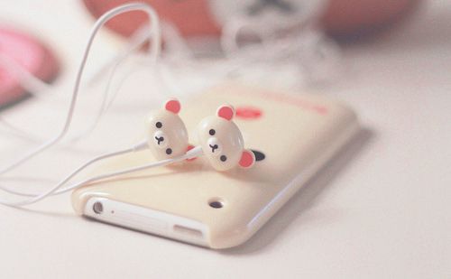
Step Two. Okay, after that adjustment, you can see that everything is more red/pink. The image itself had yellow in it and it seems completely washed out by the red now. Plus, the black isn't very prominent in the image either, right? There is a solution! Create a new adjustment layer for selective color like you did before. Then apply these settings:
SPOILER!!: step two YELLOWS
Cyan: +100 BLACKS
Black: +100
Your image should look like this now and you should have TWO selective coloring layers and your original image. 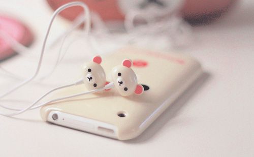
Step Three. You can bring out shadows in two different ways - by using the burn tool or by creating another adjustment layer. The image is very light, so it's probably best to bright out some of the shadows that the picture has. To make this layer, you go to Layer > New Adjustment Layer > Levels. It varies with each image where to drag the arrows for the levels. By default, your levels settings should look like this. The three arrows under the jagged lines represent, from left to right, shadows, midtones, and highlights. Usually I just drag the shadows' arrow to meet where the jagged lines first start, like so...
Step Four. Next, I created a Brightness/Contrast adjustment layer. After the levels, the image just looks a tad bit too dark for my taste. So, I went to Layer > New Adjustment Layer > Brightness/Contrast and these are my settings:
SPOILER!!: step four
Brightness: +20
Contrast: -35
what it should look like after that step... 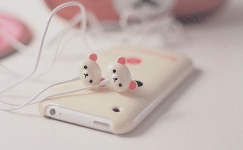
Step Five. Don't worry, we're almost done! But look at it, doesn't the image look a bit softer after the Brightness/Contrast layer? Well, with this new adjustment layer we'll be bringing back some of the reds! I created a new Hue/Saturation layer by going to Layer > New Adjustment Layer > Hue/Saturation and applying the following settings:
SPOILER!!: step five
Hue: +6 (it brings out some yellow)
Saturation: +30 (the colors are popping now, yes?)
Lightness: -7 (you don't want it to be TOO bright, do you?)
And at this point, my image looks like this: 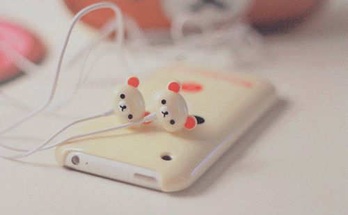
Step Six. This is the last step, I promise. Lastly, I created a Channel Mixer. To make the image look 'cooler' color-wise, I messed around a little bit with the Red channel...
SPOILER!!: step six
OUTPUT CHANNEL: RED
Red: +112
Blue: -18
Final: 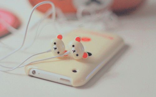
Doesn't it look slightly less rosy? What I do with a lot of my coloring is reuse them. It just requires so much work trying to make something new, doesn't it? To make this coloring work with other graphics, I group it and lower the opacity level, add a curve and it's practically something new! For example, this image of Natalie Dormer (from a request) has the exact same coloring, but grouped with an opacity level of 49% and two preset curves (lighter) under it.
That is the end of my tutorial! As mentioned in the interview, there is a texture that is currently my favorite. It's been used in MANY of my graphics and I thought I'd share it with you! Click HERE. I can't remember where I found it but I am pretty sure it is through google somewhere. What I usually do with that particular texture is put it on top of all my work and set it to screen, lower the opacity to somewhere around 40~50% then add a curve with the preset setting of medium contrast. It just adds a little something to the graphic.
|