If this is your first visit, be sure to check out the FAQ by clicking the link above.
You may have to register before you can post: click the register link above to proceed.
To start viewing messages, select the forum that you want to visit from the selection below.
HELLO, FRIENDS AND ENEMIES. This is my third Seektober thread, and I'm going in a different direction this year. I hope it makes sense on paper/in pixels as much as it does in my head. This year, I'm going to create color palettes inspired by the prompt, along with a little watercolor 'doodle' to showcase the colors together. I will also try to post the inspiration for the palette. Cross your fingers this makes a lick of sense.
I'm using the Aparecium method with a random number generator, so we're going to get a truly mixed bag approach!
ThunderPUFF | Whoodley | MRD&LKD | Graphics Queen | Tristalen | Mrs. A | Hunny Bun
Okay. I'm moving in here now *packs bags* it's too pretty *grabs blanket and pillows*
I think watering can is my favorite so far *creates nest in a corner of the thread and plops down* hydrangeas are my favorite! Just beautiful!!!!!!!!!!!!!!!!!!!!
__________________
⫷⫷____________________________________________ I know that you're afraid to...
...let all the dark escape you._____________________________________________⫸⫸
Made of Awesome | Ern-la the Best-wa | TZ's Apogee
SPOILER!!: frens
Quote:
Originally Posted by sweetpinkpixie
I continue to absolutely adore these and every single four color palate is just so perfect I really cannot imagine you substituting any of them out for anything better. They all compliment each other so much and your ink details with the doodles are just so...sdjflsdfjlsd I adore these, kay? For 'grey', I especially love how the edges of the watercolor become the edges and lines for the flora and it is may be one of my favorites despite your reservations. Dungeon is such an interesting take too and I love the composition of the doodle so so much. 'Watering can' also is so soft and lovely and I love how you drew (har har) parallels between different types of flowers and it is just so Before I even read your blurb on 'animagus' I was getting stained glass window vibes and I just love it too. Your brush strokes on this one are so elegant!
Hi, welcome back! Sometimes, the splotchy bits lend themselves to a specific shape, and they OFTEN lend themselves to be flowers. It helps that the purple and orange sort of remind me of pansies, and that's generally the floral shape I went with. Don't quote me on ever trying to draw real flowers, though.
I'm glad you like the stained glass vibes in my animagus doodle. I've done some other things like this, so maybe I can post one of them in my regular thread someday.
Quote:
Originally Posted by Emzily
Oh, I LOVE this concept so much. The colours and blends you have used on each piece are perfect and so pleasing on the eye, I am looking forward to coming back here! Especially love the dungeon and mischief prompts.
Hi, thanks for visiting! I'm glad you like the concept, since I still sometimes feel like I'm cheating my way through while everyone else is drawing. I hope you like some of the new stuff I post soon!
Quote:
Originally Posted by emjay
You're right, I would think of gray when thinking about a dungeon, but when I saw your inspiration photo I could totally see those colors as the hopeful light at the end of a gray tunnel. It works so well. And I would totally wear those colors in Grey. I tend to like more muted colors with just a pop of a bright color. Lovely.
I think you'll get sick of all the ways I love throwing gray into a palette, but at least I managed to avoid it in the dungeons! And I think orange and gray looking so nice together, but I'm not sure I would consider wearing them together unless already in a print or pattern. Maybe I'll take the plunge (and buy something orange).
Quote:
Originally Posted by BanaBatGirl
Wow. STUNNING. You are absolutely killing it with the watercolors here, MY FRIEND, and I adore the little palettes to the side.
What a champ. What a beaut. I've liked and subscribed. Such a feast for the eyes!! Please, keep them coming.
Hey, stranger. THANKS for the nice words. Come feast again soon, lady.
Quote:
Originally Posted by Suziella
Okay. I'm moving in here now *packs bags* it's too pretty *grabs blanket and pillows*
I think watering can is my favorite so far *creates nest in a corner of the thread and plops down* hydrangeas are my favorite! Just beautiful!!!!!!!!!!!!!!!!!!!!
Well, while you're here, get comfortable. I love hydrangeas too, although I've never tried to paint them. Maybe a future project?
Day 9 - Accio
SPOILER!!: Inspiration Image
I'm sorry that this one ended up looking a bit like Winnie the Poo in the sky with those colors. And then I was going for like... ribbons of color in a cloud, but the surface was wetter than I wanted, so it diffused some. Maybe that's what I was really going for. We'll never know. Anyway, I wanted brightness and motion, since this is an early spell they learn at Hogwarts and I always think of cushions zipping through the air.
Made of Awesome | Ern-la the Best-wa | TZ's Apogee
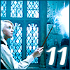
Day 11 - Occlumency
SPOILER!!: Inspiration Image
When I thought about this skill, I thought of a big strong wall built up in the mind to keep any looky-loos from peeking. But I spotted this inspiration image, and the colors are so still and quiet, and the wall isn't imposing but seems sort of to continue patiently on without end, and I preferred this to the stack of bricks. ANYWAY.
Primary colors always feel so playful to me and that's the feeling I get when I look at your prompt for Accio. I really love the colors in Dragon and the little splatters in your watercolor doodle. I really like the grays with the brighter colors again. Oooh the colors in Occlumency are so soft and serene.
__________________
started like a knight in a fairytale_______________________________________________
ended like a moth in flames______________________ ______________________don't you worry I'll be fine _________________________________________________you were good for the plot line
Made of Awesome | Ern-la the Best-wa | TZ's Apogee
SPOILER!!: frens
Quote:
Originally Posted by PhoenixRising
*casually sets up camp in here to observe the pretty watercolors*
ALSO, watering can is definitely a favorite so far. But the dragon fruit is pretty close second. Loving the unique twist on these prompts
Hiiii! Put up a tent in the corner and stay a while. I think watering can is one of my favorites too.
Quote:
Originally Posted by emjay
Primary colors always feel so playful to me and that's the feeling I get when I look at your prompt for Accio. I really love the colors in Dragon and the little splatters in your watercolor doodle. I really like the grays with the brighter colors again. Oooh the colors in Occlumency are so soft and serene.
I agree about primary colors, but sometimes having all three together feels like a kid's toy to me, but I think the gray sort of softens it all. As for my splatters, those are one of my favorite features of watercolor. They sort of add motion to the whole image. <3<3
Day 12 - Confundo
SPOILER!!: Inspiration Image
Coming up with a CONFUSING prompt was really challenging, but I like where I landed. And these colors are surprisingly harmonious to me, sort of in spite of themselves.
Fanfiction Mod 4 Privet Drive Mod DERP & DoM Alley Proprietor
Blast-Ended Skrewt
Join Date: Sep 2007
Location: State of Confusion
Posts: 16,217
Hogwarts RPG Name: Vera Brinley Thanatos
Gryffindor
Seventh Year
Hogwarts RPG Name: Mandrake Beery
Slytherin
Third Year
Ministry RPG Name:
Evan Nam
Mysteries
Diagon Alley Employee:
Ece Arslan
Nesting Occamy Rentals
Anashti l Brat Pack l Sally & Dr. Finklestein
You are so excellent at choosing color palettes that compliment each other so well. I cannot even begin to pick a favorite combo of the many beautiful options you have shown us. I forever love the details you add with ink over the water colors as well. The dragon prompt is beautiful too! I originally thought snap dragons when I saw it, but looking at the inspiration photo I can definitely see the Dragon fruit too!
__________________
_________ _________________________________________ღღღღღღღღღღ
Let them point and laugh at who we are, it's you and me here dancing from the start
oh I am very behind in here too so you know what that means
time to be insufferable
the colour palette you chose for dungeon is so neat, like I am not opposed to grey but i like this!!! I won't deny I stared at the little doodle that goes with it for maybe longer than was necessary, it's so captivating and such a pleasure to the eye. and what you did with the paint for grey with those flowers, wow. I could stare at these things all day, ern ;;
big fan of the bold ribbony swooshes in the accio prompt, and I can see the connection between prompt and final piece perfectly. ALSO, for dragon, there is just something about red/black/green combos that is pleasing to my eye, so I will let you off for depriving me of dragon scales (that, and your floral pieces are always so cool to look at)
i'm so on board with your thinking behind occlumency, there's a kind of serenity to it and i... have already said i'm on board, so consider me on board x2. and and and and then CONFUNDO. this is one of my favourites, I think. it's absolutely the vibe and everything about it works so well, the colours and the composition and... all of it. i wish to lick it.
love ur work!!! give me more!!
__________________
Days of Potter 2023:___________________________ Which Bertie Botts Flavour Are You? You are Chocolate!
Made of Awesome | Ern-la the Best-wa | TZ's Apogee
SPOILER!!: hallo frens
Quote:
Originally Posted by Chelliephone
You are so excellent at choosing color palettes that compliment each other so well. I cannot even begin to pick a favorite combo of the many beautiful options you have shown us. I forever love the details you add with ink over the water colors as well. The dragon prompt is beautiful too! I originally thought snap dragons when I saw it, but looking at the inspiration photo I can definitely see the Dragon fruit too!
I think snapdragon would have been an excellent prompt too, and the shades would have come out more pink and yellow and grass green based on some of the versions I've painted before. Still not the scaley look some people would expect, right?
Quote:
Originally Posted by Felixir
oh I am very behind in here too so you know what that means
time to be insufferable
the colour palette you chose for dungeon is so neat, like I am not opposed to grey but i like this!!! I won't deny I stared at the little doodle that goes with it for maybe longer than was necessary, it's so captivating and such a pleasure to the eye. and what you did with the paint for grey with those flowers, wow. I could stare at these things all day, ern ;;
big fan of the bold ribbony swooshes in the accio prompt, and I can see the connection between prompt and final piece perfectly. ALSO, for dragon, there is just something about red/black/green combos that is pleasing to my eye, so I will let you off for depriving me of dragon scales (that, and your floral pieces are always so cool to look at)
i'm so on board with your thinking behind occlumency, there's a kind of serenity to it and i... have already said i'm on board, so consider me on board x2. and and and and then CONFUNDO. this is one of my favourites, I think. it's absolutely the vibe and everything about it works so well, the colours and the composition and... all of it. i wish to lick it.
love ur work!!! give me more!!
You left a LOT of comments, and that's my favorite thing. I'm glad you like my little doodles. I think I told someone on an earlier post that this makes me feel like I'm cheating the system a little, but it's keeping me engaged and wanting to paint/draw every day, and I think that's really the point.
Also, I think the confundo doodle and palette is one of my favorites too. The colors don't feel redundant with anything else I've done, and I haven't done overlapping color topography before. that makes sense in my head...
Please don't like the art, but come back for more anytime.
Quote:
Originally Posted by FearlessLeader19
Okay, but the Accio and Confundo prompts? :3: DELIGHTFUL! Absolutely delightful! I really, really enjoy the colours you choose, Ern!
Thanks! I'm glad you liked Accio because it's so bright bright bright to me, but I like Confundo too! <3
Day 13 - Lonely
SPOILER!!: Inspiration Image
We're going for melancholy with these colors, and I think there's something about the subtle warmth of the pink that makes the Prussian blue all the cooler. I did cheat a tiny bit and include two shades of the same blue, but it's for effect. The drama, if you will. <3
Your inspiration image is perfect for Confundo lol. I remember as a young girl, patiently untangling necklaces, and this kind of reminds me of that lolol. Your doodle looks like such a lovely abstract piece, I really enjoy it. Aww my branding colors in lonely - your doodle and handling of the colors make me think of a rainy day. I really like the colors in tea as well. I'm a big fan of complementary colors and they work so well here.
__________________
started like a knight in a fairytale_______________________________________________
ended like a moth in flames______________________ ______________________don't you worry I'll be fine _________________________________________________you were good for the plot line
Made of Awesome | Ern-la the Best-wa | TZ's Apogee
Quote:
Originally Posted by emjay
Your inspiration image is perfect for Confundo lol. I remember as a young girl, patiently untangling necklaces, and this kind of reminds me of that lolol. Your doodle looks like such a lovely abstract piece, I really enjoy it. Aww my branding colors in lonely - your doodle and handling of the colors make me think of a rainy day. I really like the colors in tea as well. I'm a big fan of complementary colors and they work so well here.
I had to go back and check that there was SOME difference from the last time I reminded you of your brand colors. And it's different enough that I don't think I have to be paranoid. I'm bound to get a little redundant at some point with a limited number of colors available to choose from... right?
Also, the orangey in the tea prompt is burnt sienna and it's one of my favorites to work with. I probably use it more than I should, but it's much more natural looking than orange and it does nice things when mixed with other colors. <3
Day 15 - Brave
SPOILER!!: Inspiration Image
Bit more cheating today, since I did two shades of black, the rose, and then the black and rose together... Just so you know, it's apparently cheating to buy black as a watercolor (although I have it in a palette already), so I typically mix sepia (brown) and a blue-gray color (Payne's Gray, iykyk) to make this shade.
Also, I chose this inspiration for 'brave' because I feel like sometimes the bravest thing you can do is face down your own demons and look yourself in the face. There's something self-reflective about this one.
Wizarding World RPG Admin Minister for Magic DoM & MO Alley Proprietor
Romanian Longhorn
Join Date: Aug 2010
Location: The Paths
Posts: 39,343
Hogwarts RPG Name: Anna Walles
Hufflepuff
Sixth Year
Hogwarts RPG Name: Sage Ransom-Kruus
Slytherin
Sixth Year
Ministry RPG Name:
Charles Hollingberry
Minister's Office
Ministry RPG Name:
Airey Flamsteed
Mysteries
Diagon Alley Employee:
Zachaël Lufkin
Owl Post
x12 x12
astronomizzle ♧ gryffinDORK | & the rest is drag ♣ #badluckDerf
I blink and suddenly there is SO much pretty to look at and respond to
Accio - I quite like the soft Winnie the Pooh aesthetic and Accio as a spell feels very fitting for that silly ol' bear. That really vibrant cherry red is so pretty.
Dragon - love love love loooove how those flowers came out and the little flicks of paint. It looks so effortless and I'll take ten greeting cards with this image, please and thank you. (For real, where is the etsy shop?!)
Occlumency - I adore how your brain works and conceptually this is so so nice and these colors are so calming - which you probably do need a calm mind to hone this skill properly so, TADA.
Confundo - okay...but...I LOVE your inkings on this one and I feel like I'm looking at a highly stylized world map and I love it. I'll take ten of these too
Lonely - that Prussian blue really is pretty! Also, I see like...a sad little magical creature there on the left...with spikey hair and little sad eyes and a big ol' round nose
Tea - oh gosh the COLORS on this one. The way they blend together for your blob/orbs is so pretty and I (AGAIN) adore your inklings. The soft multiple lines for the circles are so gentle and the placement of those ~random~ dots has such beautiful balance. You have such a mastery of using space
Brave - I'll take 30 of these, yes. I LOVE this one so much and your inspiration and reflection to make it gosh...I just love everything in this thread so much
__________________
When youre stuck in a moment and your spark has been stolen .................................................. ........... this is our time to own it, so own it..................................... baby we were born withfire and gold in our eyes
Now THIS is a color palette I would wear - and DO wear all the time lmao. Love me a good Payne's Grey. And these colors just work so, so well together. Totally get the self reflection here.
__________________
started like a knight in a fairytale_______________________________________________
ended like a moth in flames______________________ ______________________don't you worry I'll be fine _________________________________________________you were good for the plot line
Made of Awesome | Ern-la the Best-wa | TZ's Apogee
SPOILER!!: hi frens
Quote:
Originally Posted by sweetpinkpixie
I blink and suddenly there is SO much pretty to look at and respond to
Accio - I quite like the soft Winnie the Pooh aesthetic and Accio as a spell feels very fitting for that silly ol' bear. That really vibrant cherry red is so pretty.
Dragon - love love love loooove how those flowers came out and the little flicks of paint. It looks so effortless and I'll take ten greeting cards with this image, please and thank you. (For real, where is the etsy shop?!)
Occlumency - I adore how your brain works and conceptually this is so so nice and these colors are so calming - which you probably do need a calm mind to hone this skill properly so, TADA.
Confundo - okay...but...I LOVE your inkings on this one and I feel like I'm looking at a highly stylized world map and I love it. I'll take ten of these too
Lonely - that Prussian blue really is pretty! Also, I see like...a sad little magical creature there on the left...with spikey hair and little sad eyes and a big ol' round nose
Tea - oh gosh the COLORS on this one. The way they blend together for your blob/orbs is so pretty and I (AGAIN) adore your inklings. The soft multiple lines for the circles are so gentle and the placement of those ~random~ dots has such beautiful balance. You have such a mastery of using space
Brave - I'll take 30 of these, yes. I LOVE this one so much and your inspiration and reflection to make it gosh...I just love everything in this thread so much
I waited a while to post this time just for you. Also because I was busy, but let's say it was for you. I'm glad you stopped by, though, and thank you for all the commentary. I especially like that you enjoyed the Winnie the Pooh Accio one, since I wasn't too sure about that one.
You keep ordering duplicates of the SAME THING, rather than 10 or 30 or whatever of different things. You should order DIFFERENT things. But I"m on to you now, and I see what you like the most is the loose florals. I'll have to keep that in mind when I send you 10 of the same thing.
PS: I now see the sad little creature with the big nose too.
Quote:
Originally Posted by emjay
Now THIS is a color palette I would wear - and DO wear all the time lmao. Love me a good Payne's Grey. And these colors just work so, so well together. Totally get the self reflection here.
I knew that if ANYONE was friends with Payne's Grey already, it would be you. I love pink and gray, especially this nice soft rose color. I don't look particularly healthy in pink, so I don't wear these much, but I like how they look together.
Day 16 - Loyalty
SPOILER!!: Inspiration Image
Loyalty is a hard concept to come up with an image or picture for. I did find some pictures of dogs (??) but it didn't really come together for me. Maybe this is cheating, but I finally went with the aster, which means 'loyalty' in the language of flowers. If it's cheating, I have no remorse, because this is one of my favorite color combinations so far.
PS: the little spiky bits on the doodle are done by blowing the paint with a straw. I saw it on a tutorial once and I'm obsessed.
Made of Awesome | Ern-la the Best-wa | TZ's Apogee
Day 17 - Patience
SPOILER!!: Inspiration Image
Okay, PATIENCE is also a really hard concept to find an image for. I COULD have cheated and used language of flowers again... is it really cheating? Stop being so judgemental. Anyway, I had this thought about patience being like wind and water slowly carving away at a mountain over millennia, and I found an image that spoke to me with those beautiful earth tones that are revealed. It seemed much more romantic an idea in my head than 'patience is erosion' so please think kindly of me.
I really like how the blue softens the whole palette... and I promise someday soon I won't end up throwing some gray into a palette, but today is not that day. This is a dirtier asphalt gray, so at least we have variety.
Wizarding World RPG Admin Minister for Magic DoM & MO Alley Proprietor
Romanian Longhorn
Join Date: Aug 2010
Location: The Paths
Posts: 39,343
Hogwarts RPG Name: Anna Walles
Hufflepuff
Sixth Year
Hogwarts RPG Name: Sage Ransom-Kruus
Slytherin
Sixth Year
Ministry RPG Name:
Charles Hollingberry
Minister's Office
Ministry RPG Name:
Airey Flamsteed
Mysteries
Diagon Alley Employee:
Zachaël Lufkin
Owl Post
x12 x12
astronomizzle ♧ gryffinDORK | & the rest is drag ♣ #badluckDerf
how about I just order 10 or 30 of everything because that is also a vibe.
Looooooooooooooove the 'loyalty' prompt and the blowing technique you used here and how that shape is mimics in your pen doodles. It's just so cheerful. And Paige says there is absolutely nothing wrong with using the language of flowers
Love your thought process for 'patience' and the colors too. Also how the ink doodles read like not only drops of water rippling out but also rings on trees or layers of rock and fossil which all ~take time~
'Greenhouse' makes me think of looking in through the window of a greenhouse during heavy rain, so the shapes inside are all blurred but all the colors are kind of blended together. It gives me a sense of warm peace #teamgray
__________________
When youre stuck in a moment and your spark has been stolen .................................................. ........... this is our time to own it, so own it..................................... baby we were born withfire and gold in our eyes
first of all yes, if it's keeping you engaged and wanting to make the arts n stuff then I'd say you're doing seektober absolute justice. and if there's such a thing as cheating in art, I'm confident that is is not it
anyways. I definitely get the melancholy in lonely, and you've made it really beautiful in putting it all together. we'll let you off for the double blue because the effect here is so goooood, and also. lov the drama. and TEA (as in the next prompt, not the drama). the blending in that particular doodle and the way the colours all merge into each other is so pretty, and there's not a line that looks like it shouldn't be there *-*
fascinated by the fact it's apparently cheating to have a watercolour black. bUt. moving on. something about blacks/pinks/greys together is sO pleasing to my eye so I really enjoy the palette you chose for brave and it's come together so nicely. with that and the line work the doodle painting is so beautiful ugh how dare you
it's no secret i love all your art and find something in everything that blows me away aaaand loyalty is no different. holy heckle, it's so... it looks like it has spirit. it's dynamic. it makes my eyes happy. *covertly licks it*
also, the next time you insinuate that anything ur doing here is cheating i am going to bop you on the head. with love. the thinking behind patience here is perfect, and I like greys in palettes !! they are very versatile and set things off so nicely. did you have to have patience to do the circles? bc I would have needed a lot of patience. AND FINALLY greenhouse ;; the colours are absolutely perfect and the little doodle is so peaceful and yet invigorating
v sorry except not really for all the many words. it will happen again.
__________________
Days of Potter 2023:___________________________ Which Bertie Botts Flavour Are You? You are Chocolate!
~ Mrs. Steve Harrington ~ It be like that sometimes.
*catches up on all the goodies here*
UGH! The heartstrings your 'lonely' piece is tugging! I legit sat here admiring that one for a bit. I'm really continuing to enjoy the colours you use. For me, coming to this thread is so relaxing because of that fact. Everything here is an aesthetic masterpiece.
Made of Awesome | Ern-la the Best-wa | TZ's Apogee
SPOILER!!: oh hello frens
Quote:
Originally Posted by sweetpinkpixie
how about I just order 10 or 30 of everything because that is also a vibe.
Looooooooooooooove the 'loyalty' prompt and the blowing technique you used here and how that shape is mimics in your pen doodles. It's just so cheerful. And Paige says there is absolutely nothing wrong with using the language of flowers
Love your thought process for 'patience' and the colors too. Also how the ink doodles read like not only drops of water rippling out but also rings on trees or layers of rock and fossil which all ~take time~
'Greenhouse' makes me think of looking in through the window of a greenhouse during heavy rain, so the shapes inside are all blurred but all the colors are kind of blended together. It gives me a sense of warm peace #teamgray
I'm going to run out of paper before you run out of enthusiasm, that's for sure. <3
I really love the blowing technique... I actually used it on an earlier one too, but it's so nice and SPIKY on this one. I almost tried to do something floral with that shape and then I just felt like I wanted to keep trying new shapes I hadn't tried before.
I really like your interpretation for patience. I was trying to mimic the round shapes of the watercolors, but it absolutely has a water ripple/tree ring feel that fits with the original prompt. I wish I could take credit for thinking of that outright, but sometimes we get to credit intuition?
And totally get what you're seeing with greenhouse. I've seen these striped paintings with horizontal lines before, but the space didn't like that. But I love the look, so I'll probably try this one again sometime.
Quote:
Originally Posted by Felixir
first of all yes, if it's keeping you engaged and wanting to make the arts n stuff then I'd say you're doing seektober absolute justice. and if there's such a thing as cheating in art, I'm confident that is is not it
anyways. I definitely get the melancholy in lonely, and you've made it really beautiful in putting it all together. we'll let you off for the double blue because the effect here is so goooood, and also. lov the drama. and TEA (as in the next prompt, not the drama). the blending in that particular doodle and the way the colours all merge into each other is so pretty, and there's not a line that looks like it shouldn't be there *-*
fascinated by the fact it's apparently cheating to have a watercolour black. bUt. moving on. something about blacks/pinks/greys together is sO pleasing to my eye so I really enjoy the palette you chose for brave and it's come together so nicely. with that and the line work the doodle painting is so beautiful ugh how dare you
it's no secret i love all your art and find something in everything that blows me away aaaand loyalty is no different. holy heckle, it's so... it looks like it has spirit. it's dynamic. it makes my eyes happy. *covertly licks it*
also, the next time you insinuate that anything ur doing here is cheating i am going to bop you on the head. with love. the thinking behind patience here is perfect, and I like greys in palettes !! they are very versatile and set things off so nicely. did you have to have patience to do the circles? bc I would have needed a lot of patience. AND FINALLY greenhouse ;; the colours are absolutely perfect and the little doodle is so peaceful and yet invigorating
v sorry except not really for all the many words. it will happen again.
Oh, hello, chatty friend. You have fulfilled your mission in keeping me coming back to post more, so good job!
I believe we've talked about licking the watercolors before, but I will allow it because I think I didn't use the toxic... nope. The yellow is bad for you. No licking the yellow.
I'm allowed to call things cheating, though, but would it be better if I called them 'art hacks'? I think the point is that I don't want anyone putting in a ton of effort to feel like I"m just sliding by slapping up things I haven't put a lot of thought into. I SWEAR I HAVE. It's just that everything is gray and/or I like flowers and/or similar colors in the same family look great together...
Come back again okay? okay.
Quote:
Originally Posted by FearlessLeader19
*catches up on all the goodies here*
UGH! The heartstrings your 'lonely' piece is tugging! I legit sat here admiring that one for a bit. I'm really continuing to enjoy the colours you use. For me, coming to this thread is so relaxing because of that fact. Everything here is an aesthetic masterpiece.
PS: I don't think any of us mind the grays
I really like the colors in that one too! And I'm glad you don't mind the gray, because I can assure you that neutrals make the world go 'round. I definitely will continue to bring them back.
Day 19 - Parchment
SPOILER!!: Inspiration Image
I just want to tell you that I have been struggling with 'cream' color for ages. It's not yellow but it isn't pink, and any time I have to make something in that shade, I just... end up with a shade that isn't quite right. This might be the closest I've ever gotten (yellow ochre and rose dore, btw, and very very watery), so I'm chuffed.
I also chose this image specifically for that dark blue quill and orange butterfly wing to add some DRAMA.
Made of Awesome | Ern-la the Best-wa | TZ's Apogee
Day 20 - Disappear
SPOILER!!: Inspiration Image
Another hard one to find an image that works. I eventually started looking at fog and mist and other natural ways that make the world sort of go away. Have you ever been out walking in a heavy fog, and the world ends only a few feet away from you?


.jpg)


 x7
x7  x8
x8

 Before I even read your blurb on 'animagus' I was getting stained glass window vibes and I just love it too. Your brush strokes on this one are so elegant!


.gif "heart eyes")
 gosh...I just love everything in this thread so much


.jpg)


