If this is your first visit, be sure to check out the FAQ by clicking the link above.
You may have to register before you can post: click the register link above to proceed.
To start viewing messages, select the forum that you want to visit from the selection below.
Couture ClosetWhether you want to show off your craft magic or showcase your original artwork, this is the place for all our SS creators to share their talents.
Hello, hello, hello! Welcome to my my little corner of Gladrags where I share some of my creative corner of SnitchSeeker where I will be sharing drawings, digital artwork, completed coloring pages, and essentially whatever happens to be tickling my 'artistic' fancy in the moment. I've had several graphic request shops over the years and currently have a joint portfolio with the lovely Ern (Cassirin) as well as a grab bag challenge. This is not a request thread, but you are more than welcome to drop a suggestion or a wishful thinking ~vibe~ I do take formal requests via PM for various things (namely graphics & manips), so feel free to contact me in private should you so desire.
This is so beautiful and lovely. I love it so much. Look at our babies ;_;
And I love the idea of him giving her a piggyback ride. Can I use this for my profile pic?
__________________
started like a knight in a fairytale_______________________________________________
ended like a moth in flames______________________ ______________________don't you worry I'll be fine _________________________________________________you were good for the plot line
Wizarding World RPG Admin Minister for Magic DoM & MO Alley Proprietor
Romanian Longhorn
Join Date: Aug 2010
Location: The Paths
Posts: 39,343
Hogwarts RPG Name: Anna Walles
Hufflepuff
Sixth Year
Hogwarts RPG Name: Sage Ransom-Kruus
Slytherin
Sixth Year
Ministry RPG Name:
Charles Hollingberry
Minister's Office
Ministry RPG Name:
Airey Flamsteed
Mysteries
Diagon Alley Employee:
Zachaël Lufkin
Owl Post
x12 x12
astronomizzle ♧ gryffinDORK | & the rest is drag ♣ #badluckDerf
OMG let me make it into a polaroid or something and you can use it as a DP I mean you can with it as is if you want buuuuuuut a little polaroid would be cute. Just sayin *wants to add something to it*
__________________
When youre stuck in a moment and your spark has been stolen .................................................. ........... this is our time to own it, so own it..................................... baby we were born withfire and gold in our eyes
started like a knight in a fairytale_______________________________________________
ended like a moth in flames______________________ ______________________don't you worry I'll be fine _________________________________________________you were good for the plot line
Wizarding World RPG Admin Minister for Magic DoM & MO Alley Proprietor
Romanian Longhorn
Join Date: Aug 2010
Location: The Paths
Posts: 39,343
Hogwarts RPG Name: Anna Walles
Hufflepuff
Sixth Year
Hogwarts RPG Name: Sage Ransom-Kruus
Slytherin
Sixth Year
Ministry RPG Name:
Charles Hollingberry
Minister's Office
Ministry RPG Name:
Airey Flamsteed
Mysteries
Diagon Alley Employee:
Zachaël Lufkin
Owl Post
x12 x12
astronomizzle ♧ gryffinDORK | & the rest is drag ♣ #badluckDerf
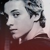
❝ Mark H. Gunter
inspiration SSRPG characters Mark Gunter (Uncle Moose) materials Adobe Photoshop Elements 9; fonts: champagne & limousines, Cheddar Jack
A private request from Jay for his character in celebration of his graduation special sort of feeling since my characters have not only been friends of this character's parents but also their professor for a bit. Long IC connections to be had here Entirely too many layers here and layer masks and all of it brought together by an amazing texture I found on deviantart
__________________
When youre stuck in a moment and your spark has been stolen .................................................. ........... this is our time to own it, so own it..................................... baby we were born withfire and gold in our eyes
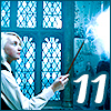
As some of you know, I've started dabbling in digital art a bit under the guidance of various YouTubers and Skillshare lessons. My iPad is unfortunately at the generation RIGHT before the Apple pencil came into play, so I don't have a lot of the flexibility and touch sensitivity that provides...but my cheap end stylus does the job well enough for practice and it's enough for now. Some day though....SOMEDAY!
Anywhoooo...I followed Flo's tutorial (linked above) and modified some things here and there. I have spells on the mind at the moment so a lightbulb for 'Lumos' seemed pretty fitting
__________________
When youre stuck in a moment and your spark has been stolen .................................................. ........... this is our time to own it, so own it..................................... baby we were born withfire and gold in our eyes
ThunderPUFF | Whoodley | MRD&LKD | Graphics Queen | Tristalen | Mrs. A | Hunny Bun
I was I could art like you!
__________________
⫷⫷____________________________________________ I know that you're afraid to...
...let all the dark escape you._____________________________________________⫸⫸
Wizarding World RPG Admin Minister for Magic DoM & MO Alley Proprietor
Romanian Longhorn
Join Date: Aug 2010
Location: The Paths
Posts: 39,343
Hogwarts RPG Name: Anna Walles
Hufflepuff
Sixth Year
Hogwarts RPG Name: Sage Ransom-Kruus
Slytherin
Sixth Year
Ministry RPG Name:
Charles Hollingberry
Minister's Office
Ministry RPG Name:
Airey Flamsteed
Mysteries
Diagon Alley Employee:
Zachaël Lufkin
Owl Post
x12 x12
astronomizzle ♧ gryffinDORK | & the rest is drag ♣ #badluckDerf
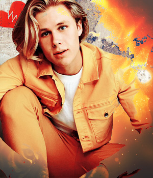
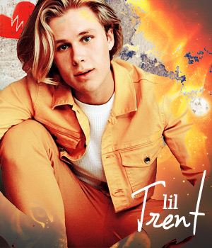
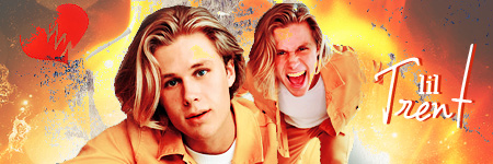
❝ lil Trent 2.0
inspiration SSRPG characters Kale Trent (pundantic) materials Adobe Photoshop Elements 9
It's 2021! This request is special (besides playing the character's little sister and being a part of a RP'd family) in that I also got the opportunity to make the set for the character in ickle form. I really lucked out with how the overlay fire texture fit and hugged the curves of the FC's pose - sometimes you find that sweet spot by sheer dumb luck. There are three texture layers here (the grunge background, the fire overlay, and then the little broken heart) and I used layer masks on the pictures of the model to erase the background. Duplicated those, sharpened, and set to soft light to accentuate the lines and colors a bit. I lost track of how many adjustment layers I used...but I think it was around 5 or 6 by the time I was done and for varying things (selective color, brightness, saturation, etc).
__________________
When youre stuck in a moment and your spark has been stolen .................................................. ........... this is our time to own it, so own it..................................... baby we were born withfire and gold in our eyes
Your graphics are always so beautiful. I love the coloring on this so much. You should do a step by step tutorial on some of these.
__________________
started like a knight in a fairytale_______________________________________________
ended like a moth in flames______________________ ______________________don't you worry I'll be fine _________________________________________________you were good for the plot line
Wizarding World RPG Admin Minister for Magic DoM & MO Alley Proprietor
Romanian Longhorn
Join Date: Aug 2010
Location: The Paths
Posts: 39,343
Hogwarts RPG Name: Anna Walles
Hufflepuff
Sixth Year
Hogwarts RPG Name: Sage Ransom-Kruus
Slytherin
Sixth Year
Ministry RPG Name:
Charles Hollingberry
Minister's Office
Ministry RPG Name:
Airey Flamsteed
Mysteries
Diagon Alley Employee:
Zachaël Lufkin
Owl Post
x12 x12
astronomizzle ♧ gryffinDORK | & the rest is drag ♣ #badluckDerf
Quote:
Originally Posted by emjay
Your graphics are always so beautiful. I love the coloring on this so much. You should do a step by step tutorial on some of these.
omg thank you, MJ I should...I forget to...and I do so much experimenting that by the time I am done I don't always know what I did to get there I meant to include a screencap of my layers...but I keep forgetting
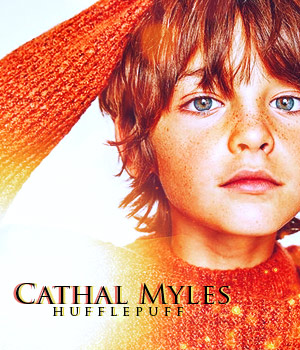
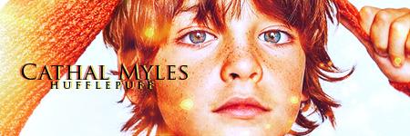
Another private request! I absolutely fell in love with this particular image of the FC and I worked everything else around that. So I upped the warm tones and did some color adjusting to change the color of the sweater to feel more Hufflepuff than Gryffindor (since it was more red) and his face was just so gosh darn cute that I really wanted it to be the emphasis. I tried my usual flip the image (one smaller and one larger) but it just seemed to take away from those freckles and thus came just the close up. There are a few light texture layers set to screen (I think it was screen) for the glow and viola!
__________________
When youre stuck in a moment and your spark has been stolen .................................................. ........... this is our time to own it, so own it..................................... baby we were born withfire and gold in our eyes
Wizarding World RPG Admin Minister for Magic DoM & MO Alley Proprietor
Romanian Longhorn
Join Date: Aug 2010
Location: The Paths
Posts: 39,343
Hogwarts RPG Name: Anna Walles
Hufflepuff
Sixth Year
Hogwarts RPG Name: Sage Ransom-Kruus
Slytherin
Sixth Year
Ministry RPG Name:
Charles Hollingberry
Minister's Office
Ministry RPG Name:
Airey Flamsteed
Mysteries
Diagon Alley Employee:
Zachaël Lufkin
Owl Post
x12 x12
astronomizzle ♧ gryffinDORK | & the rest is drag ♣ #badluckDerf
❝ Gabrielle Parker-Emerson
inspiration SSRPG character Gabrielle Parker-Emerson (Harron Peasley) materials Adobe Photoshop Elements 9
This took me ages simply because a certain voice in my head (looking at you, Joshua Miller) was being very particular on what images we used since Gabrielle is a very special person to him. It can be hard enough pleasing yourself when making graphics, so having the occasional peanut gallery chime in just makes everything worse In any case, the hair gave me the most problems in trying to erase the background. I sometimes will apply a little trick to help me with this...and it somewhat paid off here though not as seamless as it can be. Basically I will duplicate layers with the same layer mask. One layer I always sharpen and set to soft light or lighten depending on the rest of the graphic's look. When hair is particularly unruly, I will often mask out the bottom layer (the one set to normal) and then the soft light/lighten layer remains and the hair looks as though the entire background is gone. It's not an exact science but...it helps me in a clutch from time to time
__________________
When youre stuck in a moment and your spark has been stolen .................................................. ........... this is our time to own it, so own it..................................... baby we were born withfire and gold in our eyes
Those Cathal graphics! Omg the vibrancy and color, just gorgeous. The Gabrielle signature is really pretty too I like how you mention some of the things that you do when creating these. Are you using PS or Elements? I know how tricky the hair can be and I have another trick too, but I'm using PS and I don't think it translates on Elements.
__________________
started like a knight in a fairytale_______________________________________________
ended like a moth in flames______________________ ______________________don't you worry I'll be fine _________________________________________________you were good for the plot line
Wizarding World RPG Admin Minister for Magic DoM & MO Alley Proprietor
Romanian Longhorn
Join Date: Aug 2010
Location: The Paths
Posts: 39,343
Hogwarts RPG Name: Anna Walles
Hufflepuff
Sixth Year
Hogwarts RPG Name: Sage Ransom-Kruus
Slytherin
Sixth Year
Ministry RPG Name:
Charles Hollingberry
Minister's Office
Ministry RPG Name:
Airey Flamsteed
Mysteries
Diagon Alley Employee:
Zachaël Lufkin
Owl Post
x12 x12
astronomizzle ♧ gryffinDORK | & the rest is drag ♣ #badluckDerf
Quote:
Originally Posted by emjay
Those Cathal graphics! Omg the vibrancy and color, just gorgeous. The Gabrielle signature is really pretty too I like how you mention some of the things that you do when creating these. Are you using PS or Elements? I know how tricky the hair can be and I have another trick too, but I'm using PS and I don't think it translates on Elements.
That was really a stroke of luck with the image - though a sharpened layer over set to lighten also help accent freckles and those big ol' eyes. I'm using Elements bit of a learning curve adjusted from Photoshop to it when I first got it
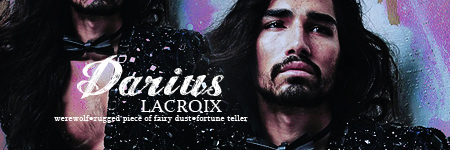
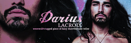
❝ Darius Lacroix
inspiration SSRPG character Darius Lacroix (sweetpinkpixie) materials Adobe Photoshop Elements 9
I first made Darius so that I could participate in a Beauxbatons RP over in St.Mungo's. His voice had kind of been this nagging thought in the back of my mind for what felt like a year but I never explored it until the opportunity for a specific RP event happened and I had been thinking about making a French charrie so the timing was right In any event, these are some updated siggies for him now that he is no longer at the school. The two purple-y ones come from the same photoshoot of his FC and have some color adjusting going on but the main effect comes from applying this texture over the images (I think I had this set to hard light but it may have been soft light...I experimented a lot with the style there ). I lost the source for it but I remember downloading it from deviantart ages ago.
The warmer siggy's effect was created using this texture (same creator as the previous one from deviantart) and is also the texture I used on the graphics for Kale Trent and Cathal Myles, just the blending modes have been set to something different I only realized after the final save of the graphic and exited out of Elements sans saving the PSD that the lyric to the song Furr by Blitzen Trapper goes 'ON fire' and not 'OF fire' he isn't complaining so I will just keep the eye twitch to a minimum every time I see it pop up in my riggy rotation.
'rugged piece of fairy dust' is a trademark of one Felixir's brain
__________________
When youre stuck in a moment and your spark has been stolen .................................................. ........... this is our time to own it, so own it..................................... baby we were born withfire and gold in our eyes
Okay something that is oddly specific that not only you do well but others do well that I am having trouble with - getting a graphic of a character to look good when cutting off part of their face! I have been practicing this...and can figure it out mostly until I try to do what you did in your second signature there. Like the top of his face is gone but it looks so natural to the rest of the graphic and COHESIVE. I am always so impressed by you, Katherine! Ugh. GORGEOUS.
__________________
"You can justify anything if you do it poetically enough."
Roman Gellar ● 1st Year ● Slytherin
Made of Awesome | Ern-la the Best-wa | TZ's Apogee
Oh, these graphics are goooooooorgeous. The coloring on Cathal's, in particular, makes me cry a little. In a good way! I might just try out some of those textures you're sharing, because I'm always looking for a new and good one.
SPOILER!!: catching up and putting it in here so I can pretend I have chill
the amount of times I have come in here to comment on things and been derailed or realised I didn't have the time I wanted to put into perusing, I swear
FRIEND. there's so much here to comment on and, fool that I am, I feel like I could hit character limit if I tried to get into all of it so uh.
first off, I really love your manips. we've discussed this, manip woes and joys, but I can't remember whether or not I've expressly said in so many words that I LOVE what you can put together. such skill. such eye. such......... layer masking or whateVER. the Jaecar and Noemi one has me particularly emo but also particularly in awe, it's amazing.
I'm finding such joy in following your continued journeys thru traditional art (and your love of those markers lmao). for your thumbs up piece, you spoke to my soul by doing a spider but not a regular (scarier) spider and in my fav colour combo. That tarantula could easily be an illustration in a book. ok? ok.
so. SO. sooooooooooo. I don't think it's a secret to you that I could stare at your graphics for hours and not get bored lmao they're so beautiful and vibrant. The way you deal with contrast and colour and light, not to mention the pain that is choosing fonts and placing text. Your work is so good I think I might hate you a little bit. no, no, I don't. yes I do
Those Cathal graphics are BEAUTIFUL wow I just had 2 highlight them. look at the little sunspot ;-;
and and and aND I'm still yelling at you for these Darius graphics lmao. more beauty, in face and in graphic skill. people are loud. people have comments.
you see what your nonsense has wrought.
thank you for the shout out tho I'm still very proud of that line
__________________
Days of Potter 2023:___________________________ Which Bertie Botts Flavour Are You? You are Chocolate!
Wizarding World RPG Admin Minister for Magic DoM & MO Alley Proprietor
Romanian Longhorn
Join Date: Aug 2010
Location: The Paths
Posts: 39,343
Hogwarts RPG Name: Anna Walles
Hufflepuff
Sixth Year
Hogwarts RPG Name: Sage Ransom-Kruus
Slytherin
Sixth Year
Ministry RPG Name:
Charles Hollingberry
Minister's Office
Ministry RPG Name:
Airey Flamsteed
Mysteries
Diagon Alley Employee:
Zachaël Lufkin
Owl Post
x12 x12
astronomizzle ♧ gryffinDORK | & the rest is drag ♣ #badluckDerf
SPOILER!!: all the kind words ;________;
Quote:
Originally Posted by kayquilz
those are BEAAAAUTIFUL OMG. KATH! *____*
Okay something that is oddly specific that not only you do well but others do well that I am having trouble with - getting a graphic of a character to look good when cutting off part of their face! I have been practicing this...and can figure it out mostly until I try to do what you did in your second signature there. Like the top of his face is gone but it looks so natural to the rest of the graphic and COHESIVE. I am always so impressed by you, Katherine! Ugh. GORGEOUS.
thank you ;_______;
It is definitely a case of trial and error and also looking at other people's work and mimicking it for practice. I tend to fall into the same pattern for how I crop with these so I want to try and experiment a bit more with tilting the original image so its not just the straight on. Sometimes you find really interesting shapes and layouts with that.
Quote:
Originally Posted by Cassirin
Oh, these graphics are goooooooorgeous. The coloring on Cathal's, in particular, makes me cry a little. In a good way! I might just try out some of those textures you're sharing, because I'm always looking for a new and good one.
I've got PLENTY and deviantart is a really great place to get some from. Will keep sharing
Quote:
Originally Posted by Felixir
SPOILER!!: catching up and putting it in here so I can pretend I have chill
the amount of times I have come in here to comment on things and been derailed or realised I didn't have the time I wanted to put into perusing, I swear
FRIEND. there's so much here to comment on and, fool that I am, I feel like I could hit character limit if I tried to get into all of it so uh.
first off, I really love your manips. we've discussed this, manip woes and joys, but I can't remember whether or not I've expressly said in so many words that I LOVE what you can put together. such skill. such eye. such......... layer masking or whateVER. the Jaecar and Noemi one has me particularly emo but also particularly in awe, it's amazing.
I'm finding such joy in following your continued journeys thru traditional art (and your love of those markers lmao). for your thumbs up piece, you spoke to my soul by doing a spider but not a regular (scarier) spider and in my fav colour combo. That tarantula could easily be an illustration in a book. ok? ok.
so. SO. sooooooooooo. I don't think it's a secret to you that I could stare at your graphics for hours and not get bored lmao they're so beautiful and vibrant. The way you deal with contrast and colour and light, not to mention the pain that is choosing fonts and placing text. Your work is so good I think I might hate you a little bit. no, no, I don't. yes I do
Those Cathal graphics are BEAUTIFUL wow I just had 2 highlight them. look at the little sunspot ;-;
and and and aND I'm still yelling at you for these Darius graphics lmao. more beauty, in face and in graphic skill. people are loud. people have comments.
you see what your nonsense has wrought.
thank you for the shout out tho I'm still very proud of that line
Why are you the way you are? *knows why but still WHY?!*
so
THANK YOU
AND I AM VERY FOND OF MY NONSENSE SO YOU'RE WELCOME
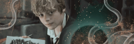
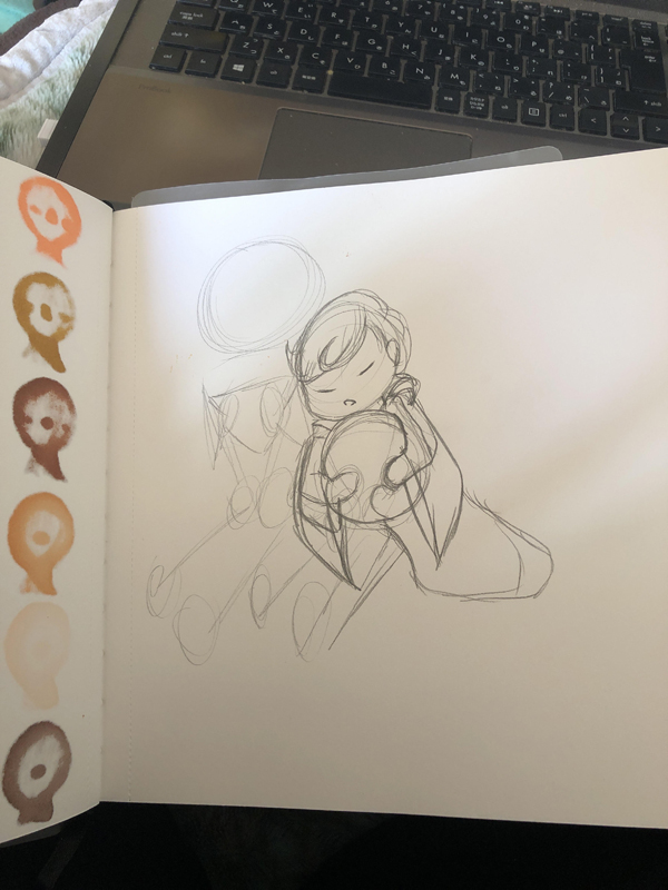
❝ Flamsteed Twins
click for larger view
inspiration SSRPG characters Atlas Flamsteed (sweetpinkpixie) and Aries Flamsteed (Samia) materials Ohuhu brush tip markers
I recently ordered two new sets (pastel and skin tones) of Ohuhu markers and I have been itching to draw more. So, today, I finally found some time to just sit and unplug with an audiobook and drew. For a while now I have been wanting to draw some chibi style characters again and I've also been wanting to try and take pages from Jay and Ern and MJ's books with drawing characters...thus I took a stab at drawing my current school RPG character and his twin brother. The line art phase was a mess (see below) and I am really pleasantly surprised with how it came out in the end - finding the right lighting to take a photo was hard and it still doesn't show the colors right (I tried twice in different locations by the window but dslfjlskdfljs). The pastel Ohuhu's really layer nicely and are what I used on their hair, eyes, and for a base on the robes before layering over them with my original 48 pack. The skin tones were fun to play with (I used YR212 milk white and YR20 for their skin with R080 pale cherry pink for the blush on the cheeks) and I am REALLY looking forward to trying out darker skin tones soon.
So, Atlas has his Pluto plushie (Toby) and Aries has an infamous large sandwich made popular by Hogwarts Mystery I've learned from previous robe doodles and attempts at shading to start LIGHT and casually build up darker...and that the black and darkest great will just never blend well so do not try...so I am pretty pleased with how the clothing (another bane of existence along with hands) came out
SPOILER!!: progression from line art to coloring
EDIT // the white space was killing me...so I added a bit more so it turned into a proper character spread of sorts
click for larger view
__________________
When youre stuck in a moment and your spark has been stolen .................................................. ........... this is our time to own it, so own it..................................... baby we were born withfire and gold in our eyes
Last edited by sweetpinkpixie; 01-25-2021 at 10:28 AM.
so. incredibly. CUTE. I love this ;___; the big sandwich is KILLING ME and I love his scrambled eggs AHHHHH eyes. And Aries big ole' smile. ugh. love your character drawing style, Kath! and you've progressed so much since getting all your markers! we love to see it!
__________________
"You can justify anything if you do it poetically enough."
Roman Gellar ● 1st Year ● Slytherin
Wizarding World RPG Admin Minister for Magic DoM & MO Alley Proprietor
Romanian Longhorn
Join Date: Aug 2010
Location: The Paths
Posts: 39,343
Hogwarts RPG Name: Anna Walles
Hufflepuff
Sixth Year
Hogwarts RPG Name: Sage Ransom-Kruus
Slytherin
Sixth Year
Ministry RPG Name:
Charles Hollingberry
Minister's Office
Ministry RPG Name:
Airey Flamsteed
Mysteries
Diagon Alley Employee:
Zachaël Lufkin
Owl Post
x12 x12
astronomizzle ♧ gryffinDORK | & the rest is drag ♣ #badluckDerf
Thank you, Kate I feel like I’m still really trying to figure out what exactly my style is and I watch a lot of tutorials on YouTube and follow along. For sure it’s not realism though I r always been a fan of the chibi style and when I was in middle school I was sooooo obsessed with CLAMP and their style so I have a lot of their influence, especially with eyes. I love how they did eyes. Though I have started to veer away from the thick cat eye like style they do and more rounded these days
__________________
When youre stuck in a moment and your spark has been stolen .................................................. ........... this is our time to own it, so own it..................................... baby we were born withfire and gold in our eyes
Wizarding World RPG Admin Minister for Magic DoM & MO Alley Proprietor
Romanian Longhorn
Join Date: Aug 2010
Location: The Paths
Posts: 39,343
Hogwarts RPG Name: Anna Walles
Hufflepuff
Sixth Year
Hogwarts RPG Name: Sage Ransom-Kruus
Slytherin
Sixth Year
Ministry RPG Name:
Charles Hollingberry
Minister's Office
Ministry RPG Name:
Airey Flamsteed
Mysteries
Diagon Alley Employee:
Zachaël Lufkin
Owl Post
x12 x12
astronomizzle ♧ gryffinDORK | & the rest is drag ♣ #badluckDerf
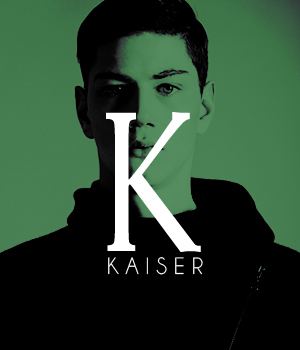
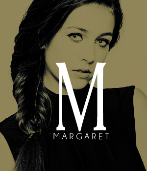
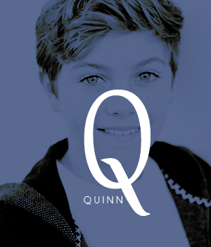
❝ minimalist
inspiration SSRPG characters Kaiser (Felixir), Bernadette Grantham (BanaBatGirl), Margaret Turov (Waddles), Quinn Kingsley (NiallNIP) materials Adobe Photoshop Elements 9, Snow White font, Champagne & Limousines font
This vibe is really all Felix's doing. We had talked about these minimalist aesthetics forever ago and they are really popular on tumblr and constantly were haunting my thoughts. So when Felix gave me the above image of Kaiser for a PP request, the composition of it all just made me think about those and that was all she wrote So after an hour of hunting for the perfect font and playing with blending modes for a color fill layer...it was a fairly straight forward process that then had me absolutely second guessing it all because it was so simple (and that's when the brain just wants to go nuts and WANTS to make things more complicated than necessary, but I resisted) and a grand total of 5 layers. So, thank you Kaiser for the inspiration
I assembled all the house colors and I am more than willing to make one for anyone who would like one - doesn't have to be a house color and can be in the color of your choice. I am also going to make a tutorial for this to share in the Sewing Lessons so you can give it a go yourself. It's a fun little experiment in color fill layers and blending
__________________
When youre stuck in a moment and your spark has been stolen .................................................. ........... this is our time to own it, so own it..................................... baby we were born withfire and gold in our eyes


 I do take formal requests via PM for various things (namely graphics & manips), so feel free to contact me in private should you so desire.


 x12
x12  x5
x5


 I mean you can with it as is if you want buuuuuuut a little polaroid would be cute. Just sayin *wants to add something to it*


 also the magical ~flare~ with the lumos


 This request is special (besides playing the character's little sister and being a part of a RP'd family) in that I also got the opportunity to make the set for the character in
 I should...I forget to...and I do so much experimenting that by the time I am done I don't always know what I did to get there

 Omg the vibrancy and color, just gorgeous. The Gabrielle signature is really pretty too
  I like how you mention some of the things that you do when creating these. Are you using PS or Elements? I know how tricky the hair can be and I have another trick too, but I'm using PS and I don't think it translates on Elements.


 I feel like I’m still really trying to figure out what exactly my style is and I watch a lot of tutorials on YouTube and follow along. For sure it’s not realism though