SPOILER!!: heeeeey
Quote:
Originally Posted by
FearlessLeader19 
Your inspiration images are simply perfect because they help to create such breathtaking pieces

I like the cream; it looks really great :3
Particularly fond of the 'disappear' piece because fog is scary yet a remarkable sight. Yep, totally been there with thick fog and not being able to see clearly! Looking at it makes me feel as though I'm looking out at an ocean and all its vastness.
Mwah. Thank you! Finding the inspiration images is sometimes harder than pulling out the colors and making the doodles. Not sometimes... every single time!
Quote:
Originally Posted by
Suziella Aww, I love your kind words and the fact that you dropped in to visit. <3<3<3
Quote:
Originally Posted by
Chelliephone I really like the pieces where you add the details over the soft watercolors. Idk what it is about it but it is just so aesthetically pleasing. Like the artwork over loyalty and the contrast of the deeper ink lines with the soft water colors is just *Chefs kiss* I'm obsessed with it. It's definitely one of my favorites!
I also really really like the way the colors in Tea and Brave all play together. It's beautiful!
I think ink and watercolor is one of my favorite mixed mediums, and it's been fun to explore using them together in ways other than what I"m used to doing. I'm glad you have some favorites here - I think the colors in Tea are some of my favorites as well!
Quote:
Originally Posted by
sweetpinkpixie Wow. I don't know what it is exactly about your 'parchment' piece bit I am completely mesmerized by it. from the blending to the flecks of color to the inking that reminds me of some mythical entity from Final Fantasy...it's just so delicate and pretty and GOSH. I really enjoy these colors in combination. Like..a LOT/
It is really fun watching you explore shapes and enjoying the result. The lines/blocks in 'disappear' is a really interesting interpretation and kind of reminds me of the lines of those clouds in your reference photo as they ~disappear~
can't believe October is already almost over and there will not be MORE of these to look forward to

*will buy more paper for you, mmhmm*
I think it's... the... blue and orange contrast so nicely? I don't know, but I think those colors turned out really interesting too. I'm trying to execute this cool random-not-random line thing I've seen before, and it's not quite there but is DEFINITELY interesting and contrasts with the colors underneath.
October IS almost over and I WILL finish with 30 palettes. Fingers crossed!
Day 21 - Sherbet Lemon
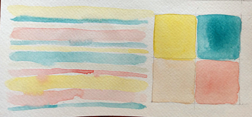
I like how these colors have a sort of retro candy store vibe, which is in line with the prompt for sure! I wish that cream showed up a little better in the doodle, because I think it sort of settles the whole palette down and keeps it from being too much... Apparently cream is the new gray now that I've figured out how to make it.